The digital landscape is constantly evolving, with diverse devices and screen sizes playing a significant role in how people interact with online content. In this context, having a responsive website is no longer an optional luxury – it's a critical necessity. But what does it mean to have a responsive website, and why is it so vital for modern businesses? Let's explore.
1. A Seamless User Experience Across Devices
A responsive website adapts to the screen size and orientation of the device it's viewed on. Whether a user is on a desktop, tablet, or smartphone, they'll receive a consistent and optimized experience, making navigation intuitive and enjoyable.
2. Reaching a Wider Audience
With more people using various devices to browse the internet, a responsive design ensures that you're not alienating any segment of your audience. Your website will be accessible and appealing to everyone, regardless of the device they prefer.
3. Improving Search Engine Rankings
Google and other search engines reward websites that provide a good mobile experience. Having a responsive design is a critical factor in SEO, making it easier for your potential customers to find you when they search for related products or services.
4. Reducing Bounce Rates
If visitors find your website hard to use on their preferred device, they're likely to leave quickly. A responsive design prevents this by automatically adjusting to provide the best viewing experience, keeping visitors engaged and reducing bounce rates.
5. Enhancing Loading Speeds
Responsive websites are designed to load quickly on all devices. Faster loading times not only please your visitors but also positively impact search engine rankings. In the age of instant gratification, speed matters.
6. Streamlining Maintenance and Updates
Maintaining separate versions of a website for different devices can be cumbersome and costly. A responsive design means there's only one version of your website to update and manage, saving time and resources.
7. Aligning with Future Technologies
A responsive website is built with flexibility in mind. As new devices with varying screen sizes continue to emerge, a responsive design ensures that your site will automatically adapt, keeping it relevant and effective in the future.
8. Increasing Conversion Rates
A well-designed, responsive website provides a frictionless path for visitors to take desired actions, such as making a purchase or signing up for a newsletter. By eliminating obstacles related to device compatibility, you increase the likelihood of conversions.
9. Building Trust and Credibility
A responsive website signals that your business is professional, modern, and customer-oriented. It builds trust by showcasing your commitment to providing a top-notch experience for every visitor, regardless of how they access your site.
Conclusion: Embrace Responsiveness, Embrace Success
In today's interconnected and device-driven world, a responsive website is an essential tool for reaching, engaging, and converting a diverse and ever-changing audience. It's not just about aesthetics; it's about functionality, efficiency, and future-readiness.
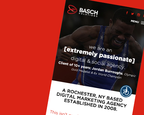
At Basch Solutions, we specialize in crafting responsive websites that not only look great but work flawlessly across all devices. Contact us today to explore how a responsive website can elevate your online presence and contribute to your business's success in the digital age.